Friday, 21 December 2012
Thursday, 20 December 2012
Questionnaire for feedback on products
Questionnaire for feedback on products
1. What do you think of my products as a whole?
2. Do you think they represent my music video?
3. Do you think the products have the professional feel in which i was aiming for?
4. what did you dislike about them the most?
5. What would you change on any of them if you could?
Wednesday, 19 December 2012

Monday, 17 December 2012

Thursday, 13 December 2012

Tuesday, 27 November 2012
Update
I have been working hard on editing the video, over 30 minutes of footage for 40 seconds of clip. Initially I have underestimated the amount of footage that is needed for the music video. I have concluded that a large amount of filming is still too be done, trying too fit it in around the weather is proving tricky but hopefully my persistence will pay off.
Monday, 19 November 2012
Text at the beginning of the video (update)
After research and trying different texts, I have decided not too use any texts, I believe that the video loses its professional finish. My initial idea was to use text to give the effect that the song was on a music channel, however just makes the video look amateur.
Tuesday, 6 November 2012
Text Poll
I asked 12 people of which they believe is the best text to use for the beginning of as music video of my genre, below are the results
Franklin Gothic Medium
Benjamin Francis Leftwich
Atlas Hands
II
Elegance
Benjamin Francis Leftwich
Atlas Hands
IIII
Verdana
Benjamin Francis Leftwich
Atlas Hands
llllll
Text Shortlist
Below are several different fonts. i created a shortlist to then use as a poll to decide which would be the best too use at the beginning of my video. although i am still unsure whether to use this as a feature.
Franklin Gothic Medium
Benjamin Francis Leftwich
Atlas Hands
Elegance
Benjamin Francis Leftwich
Atlas Hands
Verdana
Benjamin Francis Leftwich
Atlas Hands
Monday, 5 November 2012


Sunday, 4 November 2012
Work Update
Today i tried to upload a text on too my music video causing the whole unsaved work to crash and now causing me to start over again. Despite this I am still determined to carry on and do the work to the best of my potential.
on a plus side i should have my final covers finished for tomorrow and apart from the fault mentioned above everything is going to plan
on a plus side i should have my final covers finished for tomorrow and apart from the fault mentioned above everything is going to plan
Saturday, 3 November 2012
Second draft back Cover, decision to use original 2nd draft
Out of the two back covers of the second draft I asked numerous people which
they felt had the most potential to become better and 70% of the people agreed
the one with the fire was the better out of the two and had greatest potential,
as well they felt that it matched the front cover better and could be easily
linked together.
I agree with the majority of views and I am going to use the original 2nd draft back cover due to the message in which it implicates.
The image still keeps the ‘mirror’ balance of the image with the main focus point in the centre of the image, as it is on the front.
The fire also contrasts with the tree and symbolises two actions or perhaps two different feelings or interpretations of how people feel. This idea links closely to my video due to the emotions passed through the video to the audience
Friday, 2 November 2012
2nd draft CD front and back cover analysis/feedback
Once again I spoke to several people in how I could improve my second draft front and back cover this time I will use specific criticism of the individual products to improve both the front and back greater than before.
Text
The text I used also got much praise once more as they did before; I made the text more enhanced to get a greater professional feel.
However, to improve:
- I need to keep the texts on both the back and the front the same; this was an error in which I was unaware
- On the back of the cover the text is hard to see due to overlapping of the image, I will have to rearrange either the picture or the text to suit the cover.
- Experiment with position and colour of text.
- include the album name
People said that the definition of the text was greatly improved and give the album a more professional feel.
Quality
The overall quality of the image and text greatly improved and made the covers seem greatly improved due to the quality of the images used, to improve:
-
Include a barcode to keep the professional feel in
which I have tried to put across
Image
Once more the Pathetic Fallacy theme of which I wish to achieve has been praised. People felt this improved image worked well in the centre and the quality was greatly improved which held the professional feel in which I have tried to grasp with all my products. I changed and improved the images and listened to the feedback about the night and day comment and worked on this idea.
I feel that the transition from the 1st draft to the second draft was a great improvement and I feel proud of the changes that have happened. However I still feel there is improvement to be made to get the high quality/ pathetic fallacy theme in which I have wished to impose from the start.
Thursday, 1 November 2012
1st draft CD front and back cover analysis/feedback
I spoke to several
people including family, friends and even random people and asked for feedback
on the first front and back cover draft; below are several factors which were addressed:
Quality
The overall quality of the image and text was overall poor
and looks unprofessional to improve:
- Use a better quality camera so image quality isn't poor.
- Don’t use a shot from the video, it makes the
cover seemed rushed.
- Spend more time on text quality, the text seemed
over stretched and once again rushed, I will edit the text individually to seem
bolder therefore more professional.
Image
I got a lot of praise for the actual image and people seemed
to respond to the ‘pathetic fallacy’ theme in which I explained, however they did mention quality and thought the hot air balloon had no real relevance to the theme or front cover. to improve:
- To improve the image as I addressed before I
will use a greater quality camera.
- I will find a more isolated tree to show
feelings of loneliness and to represent the overall vibe that the album gives
off.
- Use a new image for the back cover, perhaps a contrast of night and day to show a quirky effect of contrast in front to back cover.
- Use a new image for the back cover, perhaps a contrast of night and day to show a quirky effect of contrast in front to back cover.
Text
The text I used also got much praise, people felt the almost
‘handwritten’ theme it gave off worked well to show an upcoming singer song
writer and I believe it represents the work in which a singer song writer has
to put in. People also said position of text was quite poor in relation to the image due to over lapping and poor finish. To improve:
- I am going to look at more texts and try them
upon the new image used.
- Keep the ‘home made’ look of the text to keep
the message.
- Experiment with position and colour of text.
Overall people agreed the album cover seemed rushed and this is something I will address with the ideas stated above. Despite its great downfall being the quality people I surveyed liked the fact that the natural theme was linked and this is something I wish to stick too.
Thursday, 25 October 2012

Wednesday, 24 October 2012


Tuesday, 23 October 2012
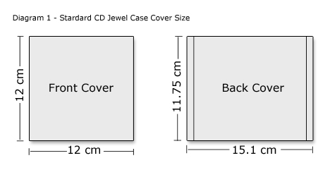
Measurements, Why?
I have searched the internet for the common dimensions
for all of my products.
I
have done this to ensure a greater professional look when all the final
products are complete
By
making the simplest of products professional it also enhances my overall professional
look in which I strive to achieve

Update
Myself and my actor, Jake Faulkner have been taking several weekends to film the beginning of my video the progress is good however i do need to wait some more time till the weather is overcast to get a greater sense of feeling from the actor. i am currently editing a draft for the video but am finding it hard to use 'Pinnacle Studio 12' to the best of its capabilities.
Friday, 19 October 2012
Several ideas for shots
A quick summary of different inspirational shots of what my music video will consist of.
Monday, 8 October 2012
Shot List
The majority of shots will consist of many close ups and tracking shots aswell as:
Long Shots
Wide Shots
Panning
and others with several edits.
The close ups/ extreme close ups will achieve a sense of loneliness perhaps brushing his hand on grass and branches.
Long shots once again will be used to gain a sense of isolation aswell as panning etc.
Long Shots
Wide Shots
Panning
and others with several edits.
The close ups/ extreme close ups will achieve a sense of loneliness perhaps brushing his hand on grass and branches.
Long shots once again will be used to gain a sense of isolation aswell as panning etc.
Saturday, 29 September 2012
Risk Assessment
|
Hazard
|
Harm
|
People at risk
|
Probability
(out of 5)
|
Severity
(out of 5)
|
Measures to be taken
|
|
Low Branches
|
Minor injury
|
Both
|
3
|
1
|
Avoid branches on pathways
|
|
Brambles
|
Minor injury
|
Both
|
3
|
1
|
Appropriate clothing
Maintain pathways
Brief ways of moving
|
|
Stings
|
Minor injury – allergic
reaction
|
Both
|
2
|
2
|
Suitable clothing worn
Known medical information
Avoid areas
|
|
Falling Deadwood
|
Minor to serious injury
|
Both
|
1
|
5
|
identify areas
Avoid areas
|
|
Trips
|
Trips and falls – minor
injury
|
Both
|
3
|
1
|
Appropriate footwear
Avoid area
|
|
Uneven pathways
|
Trips and falls – minor
injury
|
Both
|
2
|
1
|
Appropriate footwear
|
|
Weather
|
Too cold or Too hot, minor
to severe
|
Both
|
1
|
3
|
Appropriate clothing
Check weather before filming
|
|
Water
|
Drowning
|
Both
|
1
|
5
|
Be aware
Stay well away from
dangerous water
|
Saturday, 1 September 2012
Planning
This is my first upload of planning towards my music video, more planning to come (risk assesment etc.)
Tuesday, 28 August 2012
Monday, 27 August 2012
Plan of Action
To gain the grade I feel
I should be achieving it would be best for me and the quality of my work to
work alongside an action plan, and to work sufficiently to the plan.
By October
·
All Planning Complete (costumes,
health and safety risks, props, camera angles)
·
Video Analysis
·
Poster Analysis
·
Location Shots
·
Poster
·
CD Front Cover/Back/Spine (all
drafts)
By November
·
All filming should
be complete and ready to edit
By December
·
I hope the majority
of my video Is edited (will be a bonus if complete)
-
Things to take into
account are the weather and whether my actor is available and I shall have to
work alongside my video schedule in order to succeed this aim
By the end of
February
·
By the end of February I would like
to think that my whole project is complete and done and ready to get a high
mark in which I wish for
Saturday, 25 August 2012

Thursday, 16 August 2012
Target Audience
The
target audience for my music video is of a wide spectrum. i believe Benjamin
Francis Leftwichs music is generally listened to by 16-24 year olds. Due to his
young age and the singer song writing vibe it appeals to high school students
up to university students. As he is yet to hit 'the big time' he gigs at small
town venues across the UK and is yet to branch out in Europe, because of this
the genre directs towards a more 'indie' crowd due to the venues in which are
played and the audiences that are there. However despite the direction of his
music the video does appeal to several people under several circumstances.
The video tells of a teenage boy who has lost a family member/friend, immediately
this shows general links in where others can relate. Alongside this the melancholy
tune and the loneliness in which the character feels it also targets people under
this emotion.
Due
to these factors the main target audience initially seems to be of that of the fans
of Benjamin Francis Leftwich, however I wish to try and leave the video open to
interpretation to gain a wide range of viewers depending on emotions in which
they feel at the time.
Thursday, 2 August 2012
Chosen Song and Reviews on Artist
Atlas Hands - Benjamin Francis Leftwich
more information will be continued about the song and lyrics and plan for video.
Artist information
-The lost young man toting a battered guitar and a fistful of broken dreams has now become a mainstay of mainstream post-Mumford British pop culture. Luckily, York singer-songwriter Benjamin Francis Leftwich has more in common with the stark confessionals of Nick Drake.
Source: NME http://www.nme.com/reviews/benjamin-francis-leftwich/12217
-These days, picking up an acoustic guitar must be an intimidating thing. With the likes of Bon Iver, Laura Marling and Fleet Foxes emerging in the last few years, melodic acoustic music is a very crowded party. Then again, with the heritage of acoustic songwriters stretching back from Elliott Smithto Nick Drake and beyond, it probably always has been. In such a well-ploughed field, new artists practically have to spout fireworks to stand out.
Such is the challenge that lies before 21-year-old Benjamin Francis Leftwich with his debut LP, Last Smoke Before the Snowstorm. The York-based singer-songwriter has certainly garnered the requisite attention, with two well-received EPs in late 2010 and early 2011, not to mention a popular cover of Arcade Fire’s Rebellion (Lies).
Source: BBC http://www.bbc.co.uk/music/reviews/nc3q
Wednesday, 25 July 2012
Initial ideas update
Initially I wished to create a video showing ‘the morning
after’ a party. After listening to several songs during in preparation I come
across a different genre of song called ‘Atlas Hands’ by Benjamin Francis
Leftwich. Immediately the song set the scene for a lonely character, perhaps
reflecting on love or other factors in his life. The video will be set in a ‘wood
like’ setting too show pathetic fallacy and to reflect the characters emotions.
More information will be posted soon.
Tuesday, 3 July 2012
Wednesday, 20 June 2012
Introduction, initial ideas
For my A2 product i am going to create a music video to the highest standard. The music i am interested is mainly 'indie rock' or 'indie'. I wish to create a unique style video.
I will be creating the music video, album sleeve, digipack and tour posters.
An initial idea which i am interested is a character or a storyline to the video rather than images of the band. It would be a narrative of a story of a boys life after a party and the realisation of what he has done. I am still unsure on the song i wish to pick, 'leave before the lights come on' by 'Arctic Monkeys' seems very appealling due to good bridges and varaiton of tempo throughout the song. This will allow me to use many cuts and different editing techniques to reach my potential.
Subscribe to:
Comments (Atom)